I say! A subterranean semicolon!

laser semicolon

[W]hatever one’s personal feelings about semicolons, some people don’t use them because they never learned how.

In fact, when Mr. Neches was informed by a supervisor that a reporter was inquiring about who was responsible for the semicolon, he was concerned.

“I thought at first somebody was complaining,” he said.

From “Celebrating the Semicolon in a Most Unlikely Location” by Sam Roberts, New York Times, 2/18/08.

I am a big fan of the semicolon, myself; it’s an extremely useful punctuation mark.

(Thanks, Rob!)

Photo: laserColon laserSemiColon by Andrew Plumb / ClothBot; some rights reserved.

Books on the why/how of book interior design?

Woman consulting a book

Commenter “elle” is trying to find a book that’s “kind of like a manual on how to design interiors.”

Like why you use a space break, why you indent certain amounts, why chapters start new right and things that break down the skeleton of a book. It’s something that is never really taught and you kind of do these things without a reason why, its simply because “you just do.” Do you know why a part opener always starts new right backed blank? I don’t. I just know it does.

Why do we have double breaks? Why does the text start flush left afterwards?

Anyone? Anyone? The usual books I recommend are The Elements of Typographic Style and The Complete Manual of Typography, but neither of these goes into the reasons behind design conventions, as far as I can recall.

Suggestions?

Photo: Girl inspector confers with a worker as she makes a a careful check of center wings for C-47 transport planes, Douglas Aircraft Company, Long Beach, Calif. Photographed by Alfred T. Palmer. From the Library of Congress’s Flickr project. No known copyright restrictions.

A thin slice of history

image thumbnails from English Literature Flickr set

I was looking for a particular image (which I did not find) on Google Books last week, and I stumbled across this fabulous tome: English Literature: An Illustrated Record in Four Volumes. Volume II: From the Age of Henry VIII to the Age of Milton. Part II, by Richard Garnett and Edmund Gosse (New York: The Macmillan Company, 1905). It has illustrations on nearly every page, most of which are title pages from the books under discussion. Some are gorgeous, some are appalling, nearly all are interesting. And they’re all well within the public domain.
Continue reading “A thin slice of history”

How stylish are you?

Woman applying lipstick

How do you name your style sheets, those of you who bother to use them at all? Below are some of the most common style names I use for book work, which are cribbed from various sources. I use these same abbreviations to key manuscripts on those rare occasions when I’m copyediting text for someone else to typeset.

Warning: This is supernerdy. Do not click “more” unless you are prepared to be bored out of your skull.
Continue reading “How stylish are you?”

A love letter to letterpress

proof

Ampersand Duck is setting a book of poetry the slow way, and writing very affectionately about it.

You want the type to be invisible in a way, to let the meaning of the words exist independently. If a word is leaping out at you because it’s thick, dull and broken, it’s unfair to the reader. But the warmth of a handprinted page is delightful, ranging from dark greys to a dense black. It’s a small challenge for the spoilt eyes of a modern reader, to whom variety in print quality means the ink heads are a bit clogged, something to be fixed. It is the finite (and rapidly dwindling) number of letters that made me think about the preciousness of words set or written by hand. Poets are, by their nature, careful with words. It is a marvellous experience to get so intimate with a piece of writing. You may think your eyes and your mind caress a word as you read it, but imagine holding that word, piece by piece, and thinking about all its layers and nuances as you ease it into place (albeit upside down and back to front!).

(Sigh.) Sounds like fun.

Photo: proof_1 by Ampersand Duck; some rights reserved.

Is an educated author our best customer?

unhappy author at work on an earlier stage of the book

At the beginning of this week, I spent part of my lunch hour at the cafeteria (aka Whole Foods) casually consulting with a friend of a friend who’s checking the page proofs for her first book. It’s an anthology of articles about filmmaking, and it’s being brought forth by a reputable publisher of scholarly and professional books. Unfortunately for the author, her publisher is determined to produce the book as cheaply as possible: completely generic and poorly thought-out design, executed by apparently quite error-prone compositors in Hong Kong. She loathes the display type, she doubts the wisdom of the layout, she’s unhappy with the cover, . . . and her publisher has been fighting her at every step, since the moment the contract was signed. All in all, she’s not having a very warm and fuzzy experience as a first-time author.

And I’m torn, because she’s right—the interior design is hideous, and a lot of the layout choices just don’t make sense. For instance, perhaps half of the articles are interviews, and they’ve been indented on both sides, for their entire length. This wastes so much space that the body type in the book as a whole has had to be squeezed down quite small in order to make castoff. The design of the epigraphs and head notes is also ill-considered, and the front matter and display type throughout are extremely homely: too many fonts, too many styles, and utterly random indents throughout.

These are problems that a competent book designer/compositor, such as, oh, me or the designer friend through whom I know this person, could fix in one to two hours. I am dead certain that I could make the whole thing look much more inviting and coherent, while sticking to the desired page count, in less time than it will take the distraught author to mark up every single chapter title to be even small caps instead of caps + hideous fake small caps, as my friend and I cautiously recommended.

At the same time, however, looking wincingly at her stack of proofs, covered with Post-Its and liberally scrawled with deletions and additions, wordy corrections using nonstandard proofreading symbols, and requests for global layout changes, I deeply pity and sympathize with her editor and production crew. Continue reading “Is an educated author our best customer?”

Old essay on new black face

Neuland and Lithos on black books

I suspect that designers who use Neuland or Lithos as an approximation of the Africanesque are being unimaginative at best, and jingoistic at worst. —Jonathan Hoefler

This article by Rob Giampietro of Giampietro + Smith has been around for a while—having originally been published in Letterspace in 2004—but I didn’t see it until Brian Feeney blogged it, so maybe you haven’t, either.

Since I read it, about three weeks ago, I’ve been noticing these typefaces everywhere (though slightly less often than I spot Papyrus), used in exactly the way Giampietro describes. Quit it, people.

Cheap Paperbacks

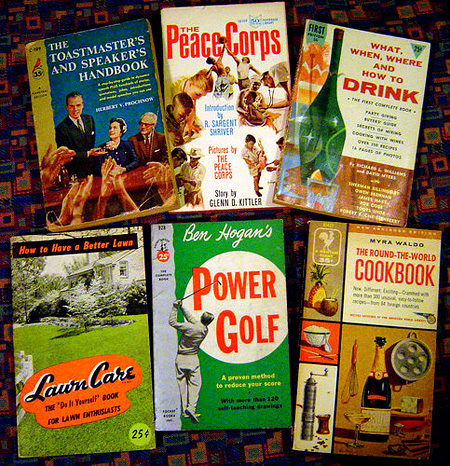
useful paperbacks

Today is your last day to buy Dino dos Santos’s typefaces at 50 percent off, but you have an entire month to scoop up goodies from House Industries at a discount.

Sale items include Neutraface, which I’ve had to work with several times and been annoyed by (something about unthoughtful OpenType setup—two jobs ago; I’ve forgotten now), but which some people like the look of, and Chalet, which I remember there being a lot of buzz about when it came out.

What I’m most interested in, though, is Paperback by John Downer (whose TypeCon presentation was one of the ones that made me cringe painfully; but I’m sure he’s very good at designing type). I first read about this when I was designing a lot of swill, and it sounded to me like a useful typeface to have.
Continue reading “Cheap Paperbacks”