My friend, the Wizard

DVD covers art directed by Eric Skillman

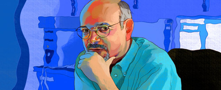
My friend and fellow club member Eric Skillman, an associate art director at the Criterion Collection, has been interviewed over at WizardUniverse.com. They’re rather in need of a proofreader, but Eric’s intelligence and charm nevertheless come through.

For example I’m looking over the DVD’s on my desk —[Aikira Kurosawa’s] “Drunken Angel”, which is one we did with Jock (The Losers, Green Arrow: Year One, Faker). There’s a scene towards the end of the film where the characters are wresting around and the Matsunaga character knocks over into some cans of paint, and the paint spills in an artful kind of way and what was his black suit gets covered in white paint, so its a sort of a transformative moment where he’s rebelling against the Yakuza influence, which is represented by the snazzy black suit that he’s been wearing and he becomes purified in that scene. We took that and said that sort of scene and idea is what we want to riff off of. We took that to Jock, along with this idea that there’s this sump thing in the middle of the town that’s full of mud and its like this sucking hole that the center of town is being sucked down by the Yakuza influence, so we said maybe give us a backdrop of this muddy, crappy, sumpy grossness then a slosh of white paint with the character sort of crawling through it, and then he took that and abstracted it one step further and did his thing and then that became the cover.

Do freelance artists usually get notes like that?

Usually.

The Wizard Q&A: Eric Skillman, by David Paggi, posted 2/11/2008.

To see more of Eric’s work (other than at your local video store) and to read a lot more about his design process, see his fine, upstanding blog: Cozy Lummox.

A window into our world

Women at Work

On Monday my bossfriend, Joanna Smith-Rakoff, explained to Bookslut what it is that we do all day at the mysterious place where we work.

What would you say a normal day at Nextbook is like?

Our days vary somewhat greatly and they’re different for different members of the staff. Let’s see: In the morning, we generally spend some time making sure that the day’s feature is ready to go, which means coordinating with our art director, India Amos, to see if art is ready. Having someone give the story a final proofread. Perhaps asking one of our assistants to add links into the story. Sometimes we’re running behind and desperately trying to come up with a hed and dek (or heds and deks, if we’re doing a package, or running more than one story); so we’ll email a few choices around, or gather at someone’s desk to brainstorm. At the same time, our assistants will be surfing the Web, choosing stories for that day’s Filter, then checking in with Sara Ivry, the senior editor who oversees it, about those stories. They’ll then write up the Filter and sit down with Sara to edit it.

On Tuesdays, we have our story meetings at lunchtime—we order lunch in, which is nice—during which we check in about various pieces in the works, bat around new ideas, suggest new writers, present pitches from writers, and sometimes discuss larger plans and initiatives. Often these meetings are long—two hours, sometimes more—because we really help each other shape story ideas (which is necessary, being that we never just say, “Okay, let’s do a review of the new Philip Roth novel”).

Hey! That’s me!
Continue reading “A window into our world”

Yap, yap, yap

Operator by Jeremy Brooks, at Flickr

John Oliver Coffey dropped me an e-mail the other morning about a new discussion forum for typesetters, aptly called . . . Typesetter Forum. It’s

a new (and free) forum for questions, answers and opinions related to the publishing industry with particular emphasis on typesetting.

Its not exactly a free-for-all (will be lightly moderated) and is oriented towards collaboration . . . and solving common typesetting challenges whether in applications or techniques. We will also post jobs, contracts, news and resources for everyone interested in the industry.

So, of course, because I was supposed to be getting ready for work, I decided to check the site out instead. Continue reading “Yap, yap, yap”

Interview with James Victore

Victoremobile

I’d never heard of James Victore before, but I enjoyed reading this.

I had one instructor in my second year, the graphic designer Paul Bacon. He gave me a D. But when I dropped out of school, I went to his office and said that I’d like to apprentice. I didn’t even know what it meant, but I wanted to apprentice with him. He looked at me and put his pen down and told me that no one had ever asked him that before. Then he agreed to let me do it. I learned a huge lesson at that moment: You have got to ask. I got that apprenticeship because no one else had ever asked. So I started hanging out in Paul’s studio, looking over his shoulder. I’d get there in the morning and sweep; I didn’t really have any jobs. And then I’d hang out. When a desk became available, I tried to do some “real” design. Three months after I dropped out of SVA, I had put together a portfolio with three fake book jackets. I started showing my portfolio, and I got hired right off the bat. I’ve been working ever since.

Continue reading “Interview with James Victore”

Old essay on new black face

Neuland and Lithos on black books

I suspect that designers who use Neuland or Lithos as an approximation of the Africanesque are being unimaginative at best, and jingoistic at worst. —Jonathan Hoefler

This article by Rob Giampietro of Giampietro + Smith has been around for a while—having originally been published in Letterspace in 2004—but I didn’t see it until Brian Feeney blogged it, so maybe you haven’t, either.

Since I read it, about three weeks ago, I’ve been noticing these typefaces everywhere (though slightly less often than I spot Papyrus), used in exactly the way Giampietro describes. Quit it, people.

Hot or not: curvy, with a prominent tail?

rock chick

This just in:

The Psychology of Fonts, commissioned by Lexmark Printers and written by psychologist Dr Aric Sigman explains how a typeface will significantly influence what the reader thinks about you.

Courier is seen as the choice of “sensible shoes” type of people or “anoraks” and curvy icons like Georgia or Shelly suggest a bit of a “rock chick” personality.

So that’s why I like Georgia: I’m a rock chick! Duuuude!!

The study found rectilinear fonts were more appealing to men, while the more round and curvy fonts with prominent tails were favourites with women.

Huh. I wouldn’t have thought it’d shake out in quite that way, but that shows you what I know about the sexes.

(Via Design Observer.)

Photo: erika’s licks by Lex in the City / Alexia; some rights reserved.

Zina Saunders draws (out) art directors

Steven Heller by Zina Saunders

What I liked about art directing, was that I love working with people and I love pulling strings and love finding artists. And I always liked typography, even though I wasn’t a great typographer. See, an art director can do it all. You can be an editor, you can be a designer, you can be a mover, you can shake things around, you can do formats; I just like the entirety of the process. But as an art director I never really loved photography; I was always much more involved in illustration. I always preferred it.

Illustrator Zina Saunders, who for some time has been posting a series of illustrations of and interviews with other illustrators, has now started working on art directors. Steven Heller is the first.

See also Zina’s several other galleries, and her websites ZinaSaunders.com and Overlooked New York. My favorites: Profile of James, the Super and An Ethnic Treasure Bites the Dust.

Illustration detail copyright © 2007 Zina Saunders. Used by permission. All rights reserved.

What typefaces writers compose in, and why

Daisy Wheel

Slate presents “My Favorite Font: Anne Fadiman, Jonathan Lethem, Richard Posner, and others reveal what font they compose in and why.” Some bits I appreciated:

I like Courier because it seems provisional—I can still change my mind—whereas Times New Roman and its analogues look like book faces, meaning that they feel nailed down and immovable. —Luc Sante

Most of my books have been set in Walbaum, which sounds like a chain store but is in fact an early-19th-century font designed by Justus Erich Walbaum, a German punchcutter whose luscious serifs may have been influenced by his early apprenticeship to a confectioner. —Anne Fadiman

Obsessing about fonts is a form of procrastination, so of course I have indulged in it ever since I graduated from a TRS-80 Model III to a Macintosh. —Caleb Crain

There’s a strong preference for Courier, which I happen to think is a good idea. Keeps the writer from getting to hung up on presentation. When I worked on the PEN literary journal, I’d format files in Courier for the staff, but in Times New Roman for the editor in chief. The book was then set in very small Adobe Caslon, and we’d find another round of typos on that version—you see different kinds of errors every time you change the typeface.

The default fonts in most of my non-layout applications are set to Georgia, Verdana, and Andale Mono. Yours?

(P.S. Man, remember daisy-wheel printers? I used to take mininaps between pages when I printed out my papers for school; each page took, like, five minutes, and I found the tat-tat-tat-tat-tat soothing.)

Photo: APL 10 by Paul Downey; some rights reserved.