(Via Speak Up.)
Author: India
Seen in the wild
(The wilds of my office, that is.)

Today I received my preordered copy of Lord Whimsy’s The Affected Provincial’s Companion, and it is exceedingly lovely. I showed it to our production god, who had never seen a two-color stamp before and immediately thought it would be a nice look for some gift edition of something that’s in the queue. I asked him if it costs less to do an all-over case stamp than to print a jacket, and he was pretty sure that it was so. The foil is billed based on the area covered, so an all-over stamp will cost more than a spine alone, but stamping a spine costs only about $75, whereas making a single correction to a jacket—and how often is there just one correction?—costs $125. And that’s not to mention printing in four colors, embossing, and laying foil over that, all of which we often do.
Continue reading “Seen in the wild”
What is this, a college dorm?!
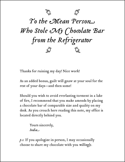
The text shown above is set in Tribute, a type family designed by Frank Heine in 2003. It is available in PostScript Type 1 and OpenType versions from Emigre.
The chocolate (not shown) was a large bar of Belgian dark chocolate squares with praline centers. I placed it in the refrigerator because even with the air conditioner set to 76 degrees all day, the chocolate was liquefying in my desk drawer.
Designers vs. Illustrators (vs. Authors)
This is not really my field, as I’m not a cover designer, but the Guardian just posted a rant by an author with the teaser (sorry—there’s a proper term for this in newspaperspeak, isn’t there?), “Now that pixels have replaced pencils the art of drawing has vanished. I’m so exasperated I’m designing my own book cover.” Supposedly, after thirteen rounds of comps and despite specifically requesting a hand-drawn illustration, the author still has only been shown covers using photographs, and she concludes that this is because designers can’t draw.
Give me a fucking break.
As someone has already posted in the comments,
- Designers design; they don’t necessarily draw. That elusive artist you’re looking for is called an illustrator.
- If the author has been asking for hand-drawn covers and the designers aren’t providing them, after thirteen rounds, it’s the fault not of the designer but of the publisher, who either isn’t
- stating this preference in the design brief, or
- providing a budget for an illustration, which is billed separately
The book and publisher are not mentioned by name, but it’s probably The Post-Birthday World, forthcoming from HarperCollins. We’re talking about a design department run by people who create their own fonts. I can’t believe they’d balk at buying or drawing an illustration. There’s clearly some backstory here.
Cheats, Shoots, and Leaves
Update: Now, with sample pages!
Ever since I tried to roughly describe how I go about designing a book, my process has been changing. Mostly, it’s because I keep getting asked to design books (1) for which I don’t have an electronic file, and (2) that need to be shot down to mass-market size. In the last six weekdays, I did 3.5 designs, and I had electronic files for only the 0.5 part. The transmittal forms for two of these books said they were to be designed so that they could be shot down. What does this mean?
Continue reading “Cheats, Shoots, and Leaves”
A Hard Case
Update: Now, with pictures!
All right, kids. You like details? Here are some details.
Pick up three hardcover books, preferably from different publishers, and remove the dust jackets. Look at the spines. Do you see the title, author, and publisher’s name or logo stamped on each spine in metallic foil? Probably. Are the colors of the foil different—e.g., one’s silver, one’s gold, one’s copper? Right. Somebody picked those. And actually there are many shades of silver, gold, and copper to choose from—not to mention colored metallics and matte colors. Somebody designed the stamp—a die—to print the spine, too. Some publishers like to have it complement the interior design; others like for it to echo the jacket.

Spines of three of the more interestingly bound books in my possession. The top is from 1816. The middle is undated but probably from 1900 or 1901, based on cues in the content; it’s blind-stamped. The bottom is from 1954 and has raised cords.
Continue reading “A Hard Case”
Thinking Semantically
Sorry, I’ve forgotten what train of linkage led me to it, but More or less via LiveClever, here are two articles by Mark Boulton that are kind of on what I was mumbling about to Michelle last week:
Semantic Typography: Bridging the XHTML gap
Designers, Engage Your Brain[s]
Another article worth checking out is his Web designer’s guide to print design.
Don't leave me dangling
Checking some proofs the other day, an error leaped out at me. Appearing on the acknowledgments page, I couldn’t help noticing this dangling modifier:
Like all other authors . . . , there are many others who helped me get this book together.
Leading a paragraph in which the author thanks his two proofreaders, I needn’t point out the irony of this error.
Can you see it? It’s a dangling modifier, and if the text of this post so far has set your teeth on edge but you can’t quite identify why, it may be because all three of my own sentences surrounding that quotation start with danglers. (To fix the quote, I’d recast the second part so that its subject is “I.”)
Here’s a dangler from a novel I set a few years ago (rendered from memory): Continue reading “Don't leave me dangling”
Ultrasparky makes my heart sparkle!
How interesting it’s been checking out all the Web sites that have been linking in since I got Kottked a week ago, and how sad it’s been to see the line on my WordPress traffic graph slope back down toward its normal point of zero. But today, today, my obsessive checking-out of every site listed on my referrer page paid off: I discovered Dan Rhatigan’s Ultrasparky, which is just delicious.
- Punctuation (quoty things, dashy things, dotty things)!
- Comic book lettering!
- Scans of a book that explains the old-school (and still very widely used) way to fit copy!
- Typographic tattoos!
Hours and hours of happy reading.
J’adore.
Study Questions
I have been shocked—shocked!—by the amount of interest in this post since it was written up on Kottke.org. Usually when I talk about what I do, people are like, “Uh huh, that sounds really, um, interesting. So, do you design covers, too?” Covers are sexy; everybody notices book covers, even if they don’t read much; no, I don’t do covers. (Well, I’ve done three. One was an unfortunate accident, and the other two are nothing special.) So, yes, all this sudden interest is very interesting to me. Plus—happy graph! Woo!

What’s been even more surprising, though, is that so far no other designers have dropped in to say, “You’re reading the castoff numbers all wrong.” “I can’t believe you used a typeface called fucking ‘Manticore’ for a fucking fantasy book!” “Trim size is actually determined based on X, Y, and Z.” “Quark is the best piece of software in the universe!” And nobody’s said, “But, the process for designing a cookbook/dictionary/art book/computer book is totally different; your half-assed workflow would never work for that.”
Continue reading “Study Questions”