Update: Now, with sample pages!
Ever since I tried to roughly describe how I go about designing a book, my process has been changing. Mostly, it’s because I keep getting asked to design books (1) for which I don’t have an electronic file, and (2) that need to be shot down to mass-market size. In the last six weekdays, I did 3.5 designs, and I had electronic files for only the 0.5 part. The transmittal forms for two of these books said they were to be designed so that they could be shot down. What does this mean?
what’s a mass-market?
Mass-market books are those crappy (but not as cheap as one might like) editions you find in drugstores, airport newsstands, Wal-Mart checkout lines, and certain sections of your local bookstore. Romance novels. Science fiction. Mysteries. They’re small paperbacks with newsprintlike paper, plain typography, and narrow margins. The type design is almost always much denser and homelier than that in hardcovers or trade paperbacks. This is partly for financial reasons—it’s a mass-market; nobody’s buying it to have as a treasured family heirloom—and partly for technical ones. These books are printed on web offset presses in such a way that they have about the quality of a bad photocopy. Gray tints turn solid black, and even line art will come out looking pudgy, as if too much ink got into the grooves. It’s not a high-fidelity reproduction medium. So certain typefaces won’t look good, and certain kinds of design elements won’t work. That’s why there’s a typeface designed specifically for mass-market designs (I don’t have it), and it’s partly why most books are typeset from scratch for the MM edition.
why are MMs a pain to design for?
As I’ve mentioned, the pages of most of our hardback books measure either 5.5 x 8.25″ or 6.125 x 9.25″. Our mass-market paperbacks measure 4.25 x 6.75″, roughly half of the hardback size. The margins on a MM are usually much smaller than on the hardcover, so we’re not actually reducing the page by 50 percent, but the reduced text block can’t be larger than 3.5 x 6.1″; a typical reduction is about 88 percent.
So the sensible thing to do is to design the MM version first, and then scale it up, right? Yes, but it’s very difficult to make that look good. In particular, in my opinion it’s flat-out impossible to make it look good if the castoff for the book is supposed to be “tight.” I can fit 2,700 characters in a 3.5 x 6.1″ box, sure, and people are used to MM books looking like a dog’s breakfast, so they won’t complain. It only costs $5.95. But if I then scale that box up to fill a larger page and charge thirty bucks for it, even with the nicer paper and the hard case and the four-color dust jacket with Foil! and Embossing!, some people flipping through the pages at B&N will perceive the essential dog’s-breakfastness of the book. It won’t look inviting. It will look dense and forbidding.
But it sure would save time and money.
case no. 1
So, of course, the first of this week’s design-to-shoots had a “tight” castoff, and I busted my ass for about a day trying to make it fit. First, working in that 3.5 x 6.1″ box, I tried every newspaper typeface I could find—newspapers sharing the MM’s need for compact type that won’t break down in a low-resolution printing process. Then I ran all the chapters together. (First choice is always to start each section on a new right-hand page; second choice is to start the first chapter on the right and let all subsequent chapters open left or right, on whatever’s the next free page. Running the chapters in, so that a new section starts on the same page, just a few lines below the end of the previous one, is the last resort.) Then I came up with a flashy, solid-black-only way to mark each new chapter. Then I scaled up my little box to a reasonably full hardcover page, and tweaked it some more. . . . Then I printed a sample at full size, reduced it on the copier back to the MM size, and took it upstairs to our lint trap.
Mr. Lint Trap’s actual job title is something glorious like “Managing Pooh-Bah”—I don’t remember—but for me, what’s important is that he filters all the stuff coming from that scary floor where the editors live. Cleans it up, sorts out the peas from the lentils, resolves unresolved questions, and protects us from evildoers. I learned the “lint trap” apellation from my friend G., who used to work in operations—i.e., ordering reprints—at Penguin. That was how G., a poet, explained his own job, and it seemed like a beautiful and useful metaphor to me. I am extremely grateful to our lint trap. And I am even more grateful that I do not have to do what he does all day.
So I took my samples up to this blessed man and said, “So, like, this is gonna look like crap. And all other books that come in with ‘tight’ castoffs that are supposed to be shoots are also gonna look like crap. There’s just no tasteful way to do it.” And he made concurring sounds, and dug through papers, and opened some spreadsheets on the computer, and concluded . . . that it wasn’t supposed to be a shoot. A mistake.
Well, I got good practice, at least.
So then, constraints eased considerably, I was able to change the body type to something less industrial, open up the leading, and fiddle with the margins. I left the run-in chapter openers as they were, as I thought they looked pretty good. Design submitted. Design approved.


Here are the front-matter pages and a typical chapter opener. D’you get it? The black bar is falling from the top of the page to the bottom as you turn each of the first few pages. Gimmicky, perhaps, but I think it’ll look cool.
case no. 2
That out of the way, I started work on a hugeous (928 pages) military history book that’s to contain twenty-four maps. The design’s not due until mid-September, but the map guy wants to make his lettering match the text design, and it’ll take him about six weeks to draw them all, so I’m holding him up. For this one, I actually had the manuscript files already, as several weeks ago I’d offered to help the editor straighten out the endnotes (which had arrived with roman numerals, numbered consecutively through the book up to eight hundred something). I whacked on it with my trusty Editor’s Toolkit for a day or so, until I had files I could roughly typeset. Then I looked for the castoff sheet and . . . there was none! I had to do my own castoff! The horror!
Fortunately, I was able to get a character count from the live files, so I didn’t have to muck about with a lot of estimating. I figured out that of the 928 total pages, the text I had needed to fit into 850. Then, since I was already in a mathy mode, I did something completely new to me: I calculated how many characters per line I’d need to fit in order to get the leading I wanted. And then I calculated what leading I’d need to get the number of characters per line I wanted. And then I calculated the margins I’d have to use. All this, before actually doing anything in Quark. Amazing. Of course, after doing all that math, I was plum tuckered out—math is hard!—so I set the project aside.
case no. 3
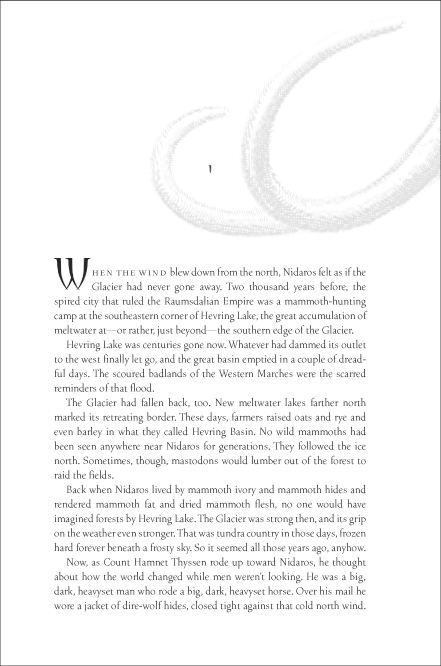
This was just me being stupid. The design was supposed to be approved Thursday, so I started . . . Thursday morning. Didn’t have files. Asked a couple of people, but didn’t receive anything until after I submitted the design. So in lieu of my usual skim-while-coding procedure, I had to revert to the Stuyvesant High School™ technique: read the first chapter, last chapter, and one close to the middle. Hey, it works. I met all the major characters, saw one of the villains bite off his own tongue (can you really die from that? would it really happen that fast?), and got to watch the exes bickering. More important, I got two ideas for graphic elements: glaciers and woolly mammoths.
This may shock you, but . . . being a plodding, linear person, I actually started looking for glacier pictures first, because that’s what I’d written down first. It wasn’t until I’d wasted a lot of precious time that I thought, Holy living fuck! Woolly mammoths! Found a low-res JPEG of an engraving from 1902—public domain, supposedly—and clipped out the tusks in Photoshop. Scaled the image way up, and then used a filter I’ve been trying out called—what else?—India Ink to make it look a bit more like the engraving it actually started as, and then plopped it on my chapter openers and title page. Found a display typeface that looks like tusks (Thornface); displayed stuff with it. Made two other designers look at it and said, “Do you know what those are? Woolly mammoth tusks.” They backed away slowly.
Oh, the text. In addition to doing the Stuyvesant trick, I also paged through the entire manuscript, making note of the page number of every design element (chapter openers, space breaks, verse, anything that’ll need to be designed). I get a memo with each manuscript listing the first occurrence of each element, but I (1) find that these are sometimes inaccurate, and (2) prefer to look at all the instances, in case there are any that are unusually long or short or weird or otherwise difficult to handle. Then I dropped my favorite new greeking text, Flatland, into a same-size layout I’d previously set up, so that I wouldn’t have to set margins or create master pages from scratch. And at this point, I’ve printed enough page samples of the text faces I want to try that I was able to just shuffle through them until I found something I liked.
I used Vendetta, which I love but which hadn’t seemed right for anything I’d done in a long while. It’s perfect for this, both because the slightly spiky letters go nicely with the tusky theme, and because the digital-looking but also very traditional style conceptually suits this book, which is an alternate history. I think so, at least. I took the printout up to the editors’ floor, but I didn’t ask for a response on it until Monday, since I’m out of the office today anyway (summer hours—we get alternate Fridays off), and it’ll only really be a problem if they want changes to the design. Which they can’t possibly want, because it’s bitchen cool.
Woolly mammoth tusks, people. Do you get to do this at your job?
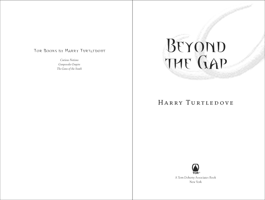

Tusk, tusk, tusk. In a separate post, I’ll explain what an unholy nightmare this very simple design turned out to be, thanks to a thorny font problem. And it’s for a three-book series. Lucky!
case no. 4
So then, flying high off that half-day triumph, I looked at my schedule and thought, Huh, that’s odd. Why does it say that design approval for that Very Important Book is due 7/31, rather than 8/7? My tag on the manuscript clearly says 8/7. Surely it’s the schedule that’s wrong . . .
Gaaaaah!!!
Yes, another book for which I didn’t have files, and another shoot, and one likely to require changes, because it’s a Very Important Book, so I didn’t intend to leave it until the last minute. It’s a short little thing, though, a gift kind of book, and they’re aiming for an older readership, so the memo said it was okay to go over castoff in order to use larger type. It’s nonfiction, a religious book, and I’d been thinking for weeks that I would do something very traditional and pretty, with lots of white space. Easy enough. So I just sat there and dealt with it.
Again, I used a typeface I’ve been in love with for a while but hadn’t thus far been able to find a use for: Tribute. I drew my little 3.5 x 6.1″ box and threw some Flatland into it. Got a smallish setting at the character count requested on the castoff sheet, and then opened it up a bit more, chucking the castoff with a clear conscience. Scaled my MM box up to fit into some generous and stately margins on the hardcover page, and then set up all my sample pages using those settings. I explored the whole Tribute family, applying some of the special ligatures and swashy things, and garnishing the pages with ornaments. Printed it at full size, reduced it on the copier to 84 percent, noted the new castoff on the covering memo, and dropped it on the editor’s desk on my way to a cocktail party. Maybe when I go in on Monday, it will have been approved.

It was, in fact, approved on Monday, but with a request to shorten the page a little, so it wouldn’t have to be scaled as much for the mass-market edition. So I reduced the leading from 17 to 16 points. By that time, I had received an electronic manuscript, so I was able to check the fit more accurately. The book contains loads of extracts, as well as nine footnotes of varying lengths, so it was a bit difficult to estimate. Here are some sample pages from the final text design. I haven’t shown the title page because I’m not thrilled with it; may rework.
let’s review
I think that’s the first time I’ve completed two designs in the same day. I don’t like to work that quickly—I’d rather sleep on it and review the sample pages again when my eyes are fresh—but it’s good to know that I can, if I revise my approach a little. I’ll get to tidy up the design a little more when I pull everything together for the composition order, and if I want to make a significant change, I suppose I can just resubmit it to editorial.
Anybody have any other shortcuts? Which of your design habits serve you well when you’re in a rush or working against other hard constraints? Which hinder you? What won’t you back down on?
For me, the last thing I’ll let go of is the length of the line. I really don’t believe I can set an eighty-five-character line of type, though I see it in books all the time; I think it’s far too hard on the reader. So I’ll give up pretty much every other design nicety if it will let me reduce the number of characters per line to what I consider reasonable (no more than seventy). But for many other designers, that’s obviously not an issue. Are you one of them? What’s your highest priority? Second-highest?
Me again. Last week I had a “rush” to do. Regular client. Book already heading to a second printing. Needed a different size for another market. Wanted flaps. Of course they wanted flaps. Anyway, I set the cover, send the proof…too tight, want changes…too loose….add headings and images (reminds me of Goldy Locks, ‘this chair is too hard…this chair is too soft…”) So, I get the “we need this tomorrow” reminder. I can’t do it. It’s 10 pm. So, I go to sleep, figure I’ll get up at 4 am do the changes and they’ll be there by the time they get into work in the morning. I hear nothing….write a note..nothing….next day..nothing….more “yooo hoooo” emails, nothing again. Day three…”oh, we changed the deadline, didn’t anyone tell you?” ARGHHHHH
I saw Imaginary Weapons featured on the Colbert Report.
Yes, Cathi, I have heard this story before!
This kind of last-minute nitpicking is another reason why I don’t like doing covers. You just don’t get this with interiors. Even for a four-hundred-page book, we usually stick to the canonical three rounds of corrections, and rarely are there any design changes.
Yet for a fucking one-page cover mechanical, with less than 200 words of text, you can go through six rounds? ten rounds? to the point where you no longer feel like it’s your own design, and you consider taking your credit line off the flap. And it’ll still have typos in it, and if the book doesn’t sell, they’ll blame you, because, obviously, it’s the designer’s fault, because you should have noticed them, even though you don’t get paid to proofread. Plus, you were late making that ninth round of changes, which we asked for at 4:49 p.m. for a 5 p.m. deadline. Maybe we shouldn’t hire you for the next project, because that one’s very time-sensitive. . . .
Yes, you feel my pain.
I still think I’d lose it more often with interiors. Just flow changes can create sooo much work. Every now and think I think I should dabble, but fortunately talk myself out of it.
I’ve done about 700 covers, maybe 100 are my designs. People have a way of turning a great design into a mediocre design with just a few changes. Gin helps ;)
Only six to ten rounds of changes? If only. I’m working on a coffee-table type book, it’s been three months so far. We’re talking dozens and dozens of rounds of revisions here!
Hi, Jedd. Is that a cover or an interior (or are your doing both)?
Both.
Well, you win with the wooly mammoth tusks. All I get are crazy cars and poorly-worded executive emails (which make me want to break out a red pen and send them back).
I like that you used Tribute; it’s such a lovely family and sounds perfect for the job. (:
Hi, .sara (dot-sara?).
Yeah, I was just looking at the Emigre site two weeks ago and put the Tribute OpenType set in my cart . . . but didn’t purchase it. Then I realized that we have the PostScript version at work, so I figured I ought to try before I buy. Now that I’ve used it, I’m totally getting the OT version.
It’s hard to lay out that kind of money for a typeface you’re not sure you’re going to use. The first typeface I ever bought for myself was Mrs Eaves, after I saw a poetry book set in it and fell in love. And while I still adore it, I must say, I’ve never used it for freelance work. It’s just too overexposed. I did get the OT Filosofia last year, as that’s one I use pretty often.
And you, you’ve got Bello! The Underware face I’m lusting after is Dolly.
Yeah, the first time I really laid out money for a typeface was for Veljovic’s Ex Ponto — which I never actually used. Except for a tattoo.
And let’s hear it for OT! So nice being able to just drop it in and go; no more fussing with Type Manager this and Suitcase that. Heh.
Dolly is killer. Plus: how do you not love the dog on the cover of the book? (:
OK, India, you may need to start a 12-step program here. I already have coworkers referring to me as the Font Queen. Other than my p.r. and newsletter responsibilities I lack the professional reason designers have for this particular obsession. I have used Ex Ponto as a program logo.
Certain fonts need a shelf life-complete with expiration date to avoid overexposure similar to what you think Mrs. Eaves has had. I think this is especially important for jackets. But that said, Bello beckons…
Bridget! Welcome back from vacation.
Well, really, I don’t much mind seeing Mrs Eaves so much—I just mind seeing it used badly. The other day I was looking at a restaurant menu that was set—if you could really use that word in this instance—in the Missus, and it was not very classy. I’ve also been seeing it a lot in, I don’t know, real estate ads? movie posters? I don’t remember where, but I didn’t like it.
When she’s good, she’s very very good, but . . . you know the rest, I’m sure.
So, what would be the purpose of this twelve-step program, exactly? To get people to abstain from using Arial?
India, a belated response- I really meant that I need the 12-step* program to abstain from further type obsession (your site is introducing me to Emigre, Underware and more). Yesterday I told a friend how I’d been annoying my 16-year-old daughter by fussing about things inappropriately set in a display type or remarking, “That’s Oz Handicraft,” while reading ads in the paper. But she’s not hard to irritate, so no big deal (or so I thought). Then he, a newspaper editor with occasional layout responsibilities, sympathized with Daughter #1. Doubt set in-do I need a more legitimate reason to obsess?
But there may be a greater need for the 12-step program you suggest. Today I was sorting through a stack of event fliers done by a coworker (I had to approve, edit, etc.) and added to my banned font list. My day job is head of p.r. & programming for a large library system. Librarians and teachers seem to [heart] Comics Sans, so that is banned. Of course, Arial, Felt and some of their cousins are currently banned. Shortly afterwards, a coworker emailed me I Hate Comics Sans as a TTF, so perhaps I am getting my point across.
I have (as I think you’ve written about) tried to explain the difference between MS-designed system fonts and those meant for print use to no avail. The bulk of my coworkers use Arial for formal correspondence. I’d like to add something to my job description that would allow me to govern such matters, but so far have had no luck.
*AP Style rules in the p.r. world, sorry!
Printers don’t seem to balk at TrueType fonts as much as they used to, so I guess there’s nothing technically that bad about using them. But so many of are just hideous—poorly made rip-offs. I’m extremely fond of Georgia; I use Verdana as my default sans for all screen applications; and I’m using Trebuchet to write composition specs on my layouts, for the moment. But the other two hundred or so fonts that are automatically installed the first time you launch MS Word, with no option to opt out? Trash! Some of them are exceedingly vile.
[…] On Thursday I started working on a composition order for a book whose castoff according to the worksheet was 320, yet whose editor asked for a page count of 256. My response on reading the transmittal was a hearty snork. For a hardcover-only design I might have been able to do something about it (something uncommonly ugly, but that’s still something). However, because this book was to be shot down to mass market, and because it was supposed to be following a previously established series design that used a rather uneconomical typeface for the body text, the closest I could get was 304. When I took the sample pages upstairs to show Mr. Lint Trap, to my surprise he said that 304—or even 320—would be fine with him, and that the editor probably hadn’t even seen the castoff before making the request for 256. Okay, that makes sense. […]